
When someone asks me to build a report or dashboard, my first step isn’t to log into Salesforce. It’s to have a conversation.
That’s because reports and dashboards aren’t just about charts, filters, or pretty graphs. They’re decision making tools. And like any tool, their effectiveness depends entirely on how well they’re designed to meet the specific needs of the person using them.
Over time, I’ve learned that jumping straight into Salesforce usually leads to more questions than answers. Stakeholders might not know exactly what they need at first, they just know they’re missing visibility. So instead of jumping into building reports, I start with a conversation.
Here’s how I approach requirements gathering for reports and dashboards:
1. Start with the User
I always begin by identifying who’s going to use the report or dashboard. Would the customer agents need to see their open cases? Or the support manager needs a high level visibility into escalation rates? Understanding the audience shapes everything from the level of detail needed to the type of visualization that will be most useful.
2. Dig into Frequency and Workflow
Next, I ask how often they plan to use it. Is this a daily dashboard that should live on someone’s homepage, or a monthly snapshot that gets reviewed during leadership meetings?
This helps me design with intention, aligning filters, grouping, and layout to match their rhythm of work.
3. Clarify the Use Case
Then I get into the purpose. Is this for operational work or strategic insights? Are they trying to identify at-risk deals, measure campaign ROI, or track case resolution times?
Often, this is where the conversation shifts. The stakeholder might realize what they initially asked for isn’t quite aligned with what they actually need. For example, they might ask for a list of closed opportunities, but what they’re really trying to understand is why win rates have dropped.
4. Understand the “So What?”
This is my favorite question: “If you had this report today, what action would you take?”
If they can’t answer that clearly, we dig deeper. A report without a purpose just adds noise. But a report that’s built around a key decision, that’s where the magic happens.
Sometimes, the most valuable insights come not from what’s shown, but from what’s missing. Maybe a region isn’t performing not because they’re failing, but because no one’s assigning them leads. That absence tells a story too.
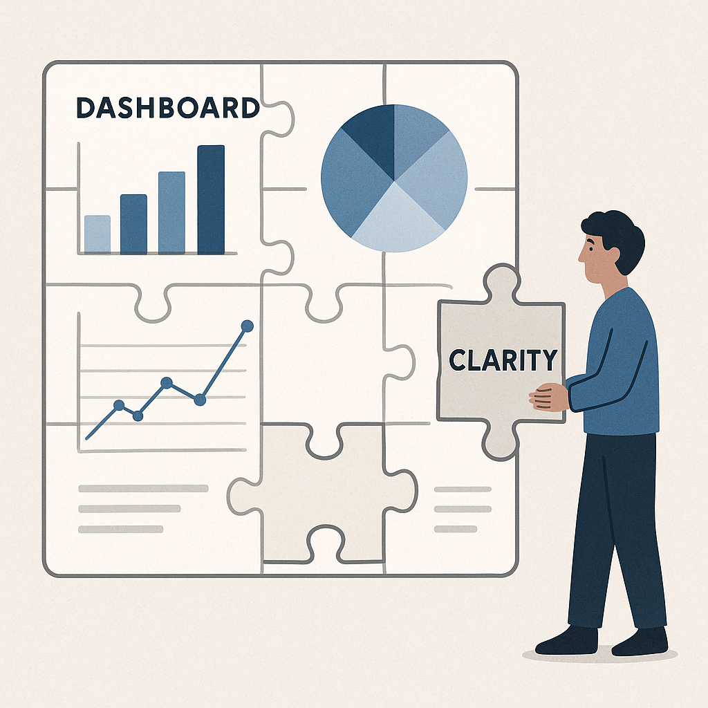
5. Design for Clarity, Not Complexity
Once I understand the full context, then I build. But even then, I keep it simple. The goal isn’t to impress with visuals, it’s to inform with clarity.
Real Example: A Service Cloud Scenario
A Support Manager from the Customer Experience team reached out with this request:
“I need a dashboard to track how many cases each agent is handling.”
It sounded simple. But instead of jumping into the report builder, I had a quick conversation to understand what was really needed.
The manager revealed that they wanted to spot when agents were overloaded, identify backlogs early, and make sure high priority cases didn’t fall through the cracks, especially during peak hours.
What started as a “cases per agent” dashboard turned into a full operational command center, featuring:
- Open Cases by Agent
- Cases Opened vs. Resolved Today
- High-Priority Cases Still Open
- Average Case Age by Agent
- Weekly Trends in Case Reassignments
This dashboard empowered the manager to redistribute work on the fly, reduce average resolution time, and improve team morale, all because we took the time to clarify the why before building the what.
Effective reporting isn’t about pulling data. It’s about pulling insight. And that starts by asking the right questions, not just creating the right charts.
So the next time someone asks for a dashboard, don’t open Salesforce right away.
Open a conversation.
That’s where the real requirements live.